
Stamplus
Year: 2018
My Role: Lead Product Designer
Stamplus is a digital platform that helps customers access their loyalty programs in one place while receiving additional perks such as offers and rewards. By partnering up with local vendors who are still using traditional loyalty programs, such as physical stamp cards, Stamplus can help them engage with their customers as they go. This automatically keeps customers up to date and the business top of mind.
As the lead designer, over the course of 6 months, I led a new design direction of the alpha build by improving the end to end experience.
Millions of people collect loyalty points every time they go shopping, and it is a way for vendors to engage with their customers. Many small, family-owned, to medium, privately owned businesses continue to give physical stamp cards and a little more than 45% of the time people become inactive users.
A need for engagement
Stamplus has validated its alpha offering and is being used by both vendors and patrons to streamline the purchasing experience.
User problem: Customers want more than just monetary gains.
Business Opportunity: Stamplus can help vendors engage with their users through personalization and redemption.
Diving into digital loyalty programs
Curious about how loyalty programs serve customers, I researched what drives customers in using them and synthesized three considerations for design:
Transparency
Building trust by showing all rewards program status and updates.
Personalization
Tailoring experiences to better engage with customers.
Redemption
Assist users in redeeming their rewards.
Design audit

Examples of Digital Loyalty Programs from Belly, Stocard, and Starbucks
Next, I analyzed how competitors in the loyalty program space serve their customers which helped provide critical insight into how the problem is currently being solved and gives me a starting point for understanding how it can be improved.
Prototype
Final prototype
With an understanding of the landscape of products both inside and outside Stamplus, it became clear to me that the best approach to solving the problem of transparency and convenience is by demystifying the process of collecting loyalty points and connecting with businesses.
I set out with 2 clearly defined goals for my designs drawing from the higher level goal of transparency and ease of use:
Clearly show enough information to the user when the user is interacting with the application, like reward progress.
If collecting and redeeming are occurring - Show that the action has been completed through visual feedback.
View original detailed app flow
First-time experience
The intro and on-boarding screens, went through several iterations to ensure that users would grasp the value of the product. I used illustrations and text to give users a better sense of what the application is about and what they can get out of it. The call-to-action button allows users to skip on-boarding.
Home page
On the landing page, users will be able to access all the merchants that they have added. From here they will get the latest offer updates and can easily access the merchant cards to check reward status.
Simplifying search
I wanted to improve the searching experience by experimenting on different types of search. Users are given the option to search by name or search nearby automatically if location is turned on. There are cases when a user is unsure of the name, and by having a search nearby button, it would eliminate the cognitive overhead of recalling the name.
Visual feedback
One of the most important actions within the application is scanning. Whether the user is collecting or redeeming, they will have to scan a QR code. Many cases, users were unsure if the scanning has been successful or not. By implementing more visual feedback states, the user will understand if they collected or redeemed their points.
Merchant profile
Users can simply access their merchant cards to see their status and the rewards that they have collected. They can also toggle for additional offers and information to get additional details.
Design Process
Stamplus user flow
Insights and Learnings
To better understand the users, I interviewed a small sample size on their shopping experience, goals when shopping, checkout process and frustrations they’ve come across.
The visual layout lacked a sense of hierarchy and legibility leading to confusion.
Lack of certainty and confidence
This means that there is no visual feedback when people are using the application to assure them that the action has been completed.
Confusion within workflow
Mainly for first-time users, they are sent to the search screen right away which confuses people because it isn’t specified how to add a merchant’s loyalty card.
Who am I solving for?
Regulars
Most customers are “Regulars” who shop at establishments enough to benefit from it.
They value monetary loyalty program benefits such as discounts and offers.
Visitors
A significantly smaller portion of customers is “visitors,” meaning they only visit the establishment once or twice.
These are typically people who are referred by others or trying new establishments.
The solution: a new experience
The initial application was very unclear when the user is interacting with the application, especially on their first time, and there was a lack of information hierarchy.
Questions that came up when designing for the new version of the app include:
How might we make the app experience feel more delightful?
What are the primary interactions of the application?
How might we improve the relationship between business and customer?
How might Stamplus offer more than the minimum viable product?
How might we strategically shift from activating users to growing and retaining users?
For new users, there will be a unique first-time experience to give them a sense of what the application is.
The app allows people to easily see all the offers from the merchants they have added.
Confirmation will appear whenever they scan a QR code or when they are removing a merchant.
With notifications turned on, consumers will be notified whenever there is a new offer or if they have a reward that they can use at a nearby merchant that they follow.
Building the information architecture
Building the IA in a diagram gave me something tangible to view the entire scope of the app. It was great at starting discussions about how anything would work: where new and old features would lie in the workflow, and how a users would ideally walk through the app. It naturally became of checklist of things the company and I were considering on each page, and a document I constantly visited and iterated on.
Wireframe
With mocked wireframes, it allowed me to conduct initial evaluations of the interface design. This gave me a high-level understanding of the structure of the application and allowed me to determine how a user would navigate. I also used these wireframes to conduct a heuristic evaluation to get user feedback and usability issues.
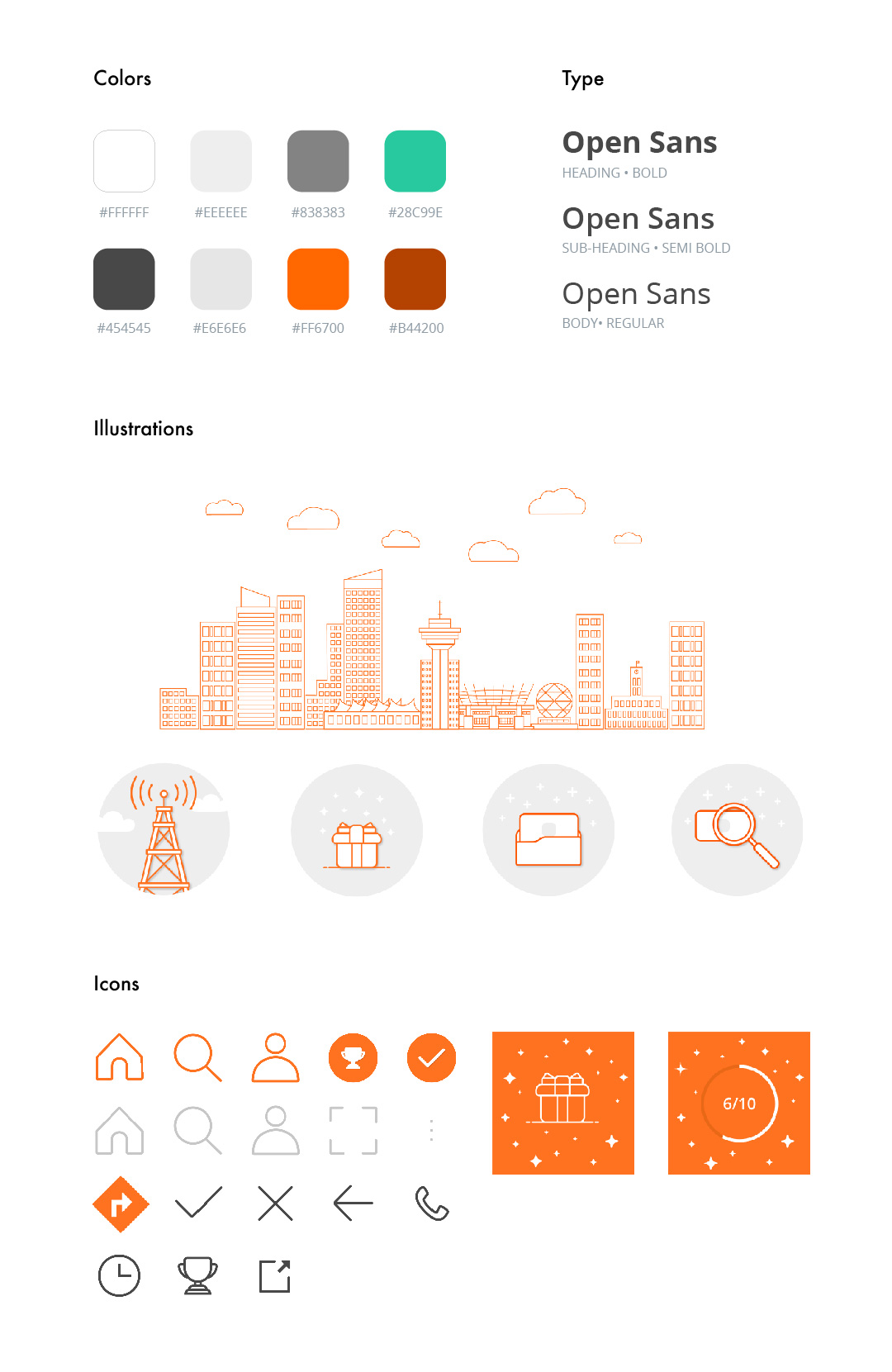
Visual design and iconography
In order to create a visual language throughout the application, the UI needs to take into consideration of inclusivity. Though it is important to meet accessibility standards, I believe that by building a visual language it can help create an inclusive environment for designers and developers in all stages.
I noticed in applications that applied accessibility standards include:
Increased color contrast to make text more legible.
Strengthened text styles by bolding.
Put emphasis on key actions through highlighting and gray-scaling UI elements.
When using the colors, I also kept the WCAG standards in mind and trying to reach both AA and AAA levels.
Challenges
1. Scope Creep
Failing to define the scope will result in uncontrollable growth. Working with the stakeholders, we continuously toggle between different ideas and adding new experiences, but it was imperative to prioritize and define the scope beforehand.
2. Additional testing and validation
Although testings were conducted, it was essential to get more feedback leading to the final design. In the beginning, this project started as just a redesign, but research showed more than that.
3. Identifying all potential dependencies
No one operates in a silo and to succeed, all dependencies need to be known. Knowing the constraints allows a smoother path to success and a better collaborative experience.
Reflection
My learning and next steps
My contribution to this project placed the design foundation for how users would be experiencing the collecting and redeeming of loyalty points. If I had more time, I would want to explore end-users’ desire for exclusive services such as VIP status.
The most important takeaway I got from working on this project was learning about taking ownership and technology limitation. Especially working as the sole designer, I would always have to be able to articulate my rationales and make informed design decisions. This allowed me to design with intent and confidence.