Credit Card Key-in
Toast Payments, November 2019 - January 2020
I was the sole designer working on the redesign of the credit card key-in flow. With the team going through PCI extraction, we could rebuild the front end of the Key-in flow while reworking the back end. The design side has the opportunity to keep the original UI or design a new one.
Credit card key-in makes up roughly 3 to 5 percent of Toast transactions, but it is a critical moment a customer faces when tap, dip, and swipe does not work or when making a payment for a phone order. I worked with my product manager to run tests to ensure that the experience will not be comprised while meeting PCI requirements, decreasing risk and cost.
Shipping on Android
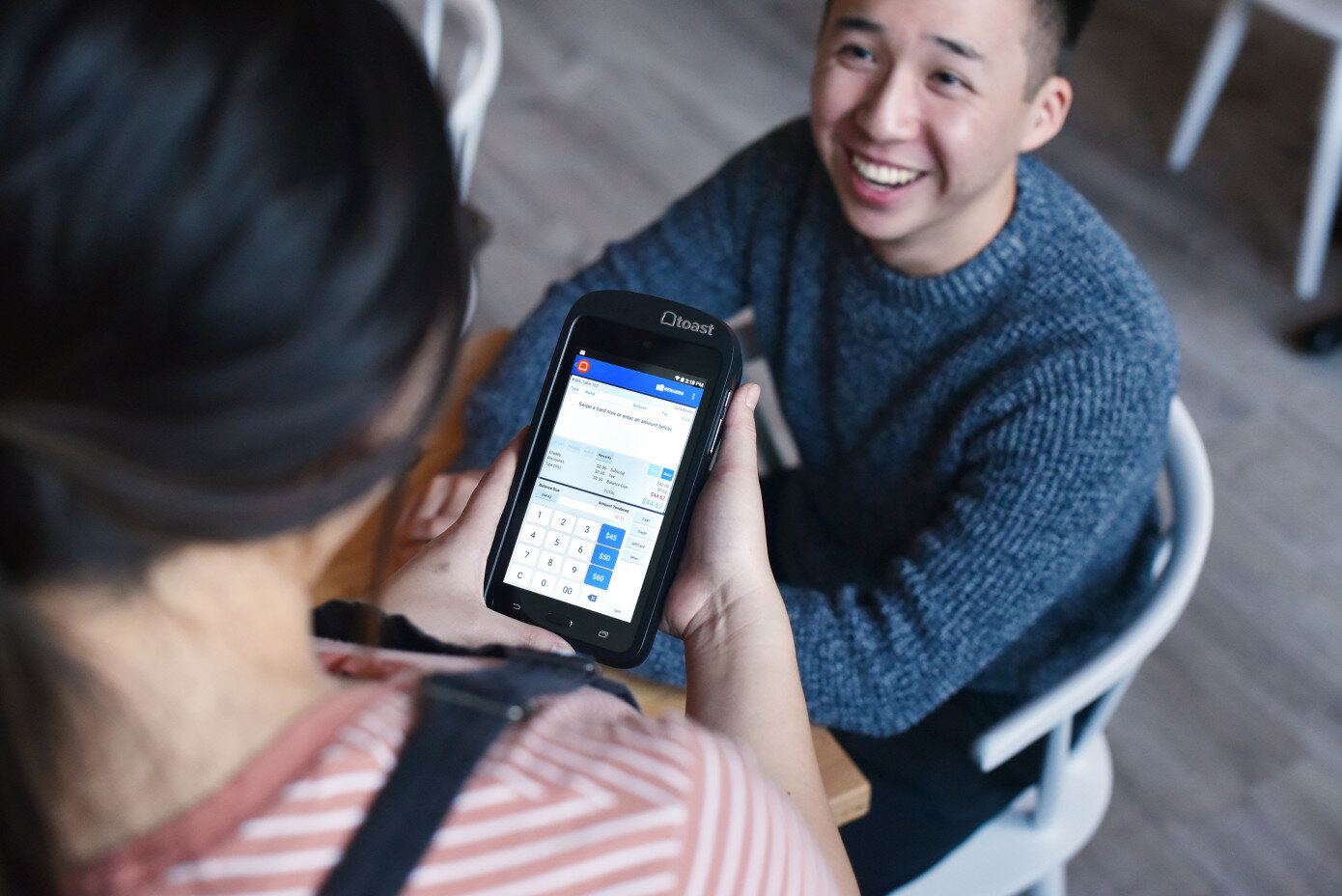
Photo credit: Toast Inc.
The Redesign of Credit Card Key-in Experience
I worked collaboratively with the design system designer, my product manager, lead designer, and engineers to make sure that the key-in experience meets our users’ needs.
Business goal: Align with Toast’s design patterns, meet PCI standards, mobile adoption, and decrease risk and cost of payment transactions.
Customer goal: Increase ease of use when customer is faced with a non typical experience.
Approach: To align the product closer to Toast's design patterns, I redesigned the key-in process, so it would take advantage of the visual real estate and allow us to use dialogues in proper situations. We hypothesize that, this will increase the ease of use and better align with our design system, which is being built in parallel.
Understanding the Key-in Experience
To get a better idea of this feature, I mapped out Toast’s existing key-in experience and analyzed our cloud and legacy competitors (ie. Clover, Square, Micros, Upserve, and Lightspeed). Since this is an employee-facing feature, there are limited sources when doing a competitive analysis.

Toast’s key-in experience map gives us a better understanding of the current flow and what users would expect.

I later broke down the existing experience screen by screen to understand the quality of the customer experience my team can both create and reconcile.
Credit Card Key-in Experience
Credit cards are not perfect, there will be times when an employee can’t read a card, or if phone calls take orders, credit card key-in will be the solution. Customers and employees don’t encounter this regularly, so providing them a secure and delightful experience is essential. Credit card key-in is risky for employees and the card owner, so we included ZIP code, which we didn’t have previously, to decrease the risk of fraud or potential chargebacks, increasing Toast’s margin.
Toast provides each restaurant with products that can help them set up their ideal guest experience. With the Toast Go handheld devices, employees can take orders and process payments on the spot. Unfortunately, the design jeopardized the employee's experience with the handheld device because there was no screen optimization for smaller screens; instead, everything was scaled down to fit.

How We Got There
Communicating design
My process involved:
Sketching concepts and flows.
Presenting to my team during whiteboarding sessions.
Translating early-stage designs into high-fidelity design comps.
Since I was working with many existing design patterns, it was relatively easy to move straight into high-fidelity designs.
Initial Prototype

1. Visual element to delight user when prompt with credit card payment screen, while aligning CTAs with Toast design patterns.

2. Visual credit card with indicators that follows each input field to assist the employee with the key-in process.

3. Error state messages will appear underneath the input field to show context instantly rather than hiding it behind an error icon.

5. Visual element to indicate to employees that there is an error while providing them with context underneath.

4. Modal to assist employees who don’t know the difference between CVV (Only on Master Card, Visa, and Discover) and CID (Only on AMEX).
Usability Testing and End Result
With little feedback from existing key-in experience and limited resources, my project manager and I conducted guerrilla user testing and interview on both the existing UI and the proposed UI experience. Since we couldn’t test this in an actual environment, I created high-fidelity mocks and invision prototypes to get closer results. The testing highlighted the top concerns in the feature:
Wayfinding
Performance
Refinement and Pivots
With user feedback, my PM and I went back to address the concerns by launch.
Wayfinding
We observed that customers did not notice the visual cues on the credit card illustration when inputting information and felt that it was just lovely to have. Even when they did see it, the graphic is inaccurate because the credit card security code is on the front for all card types, and it might cause further confusion.
The early decision to build this feature with additional visuals adds an element of delight that ended up not providing any additional value to the user. Although the illustration of the credit card was not helpful, users did find the help indicator next to the CVV to be valuable because it showcases where the CVV is, on different card types like AMEX vs. VISA/MC/ DISCOVER. It is beneficial for first-time users and young employees who don’t own a credit card and can’t differentiate between them.
Performance
Users indicated that the utilization of the whole screen made the experience better and that the input fields were more distinct because the error messages are displayed right below. The combination of month and year as a single input made more sense to the user because it replicates how a credit card shows the expiration date.
With the addition of a ZIP code input field, users hesitated because it never existed before. Though there was some friction at first, they didn’t feel like it would be a problem if they needed to ask a customer for their ZIP code when going through the Key-in process. With this additional level of security, it provides a reliable experience for the guests who are paying with their credit cards. This feedback allowed us to address the critical concern we originally had.
The Outcome
This redesign affects over 50,000 restaurants in the United States that are currently using Toast POS. Though this may not generate additional revenue and key-in transactions only make up roughly 3 to 5% of payments, it adds more clarity to the employee and guests when facing such a critical moment. It helps Toast, and their customers decrease the risk of fraud and increase our margin by $800,000 annually when taking key-in transactions. Especially with the restaurant industry's average employee churn rate of 73% will help employees who are new to processing key-in payments to understand the difference between different credit cards since it may not be well-known information.